How to Wear Burgundy and Powder Blue: Unexpected Outfit Ideas
Burgundy and powder blue outfit ideas, styling rules and elegant ways to wear this unexpected colour pairing without looking too sweet, heavy or overworked.
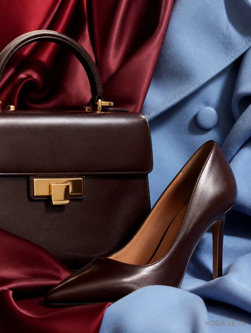
Burgundy and powder blue should, in theory, be slightly awkward together.
One is deep, rich and faintly serious. The other is light, cool and often treated as though it belongs exclusively to very expensive shirts or baby announcements.
Together, they do something much more interesting.
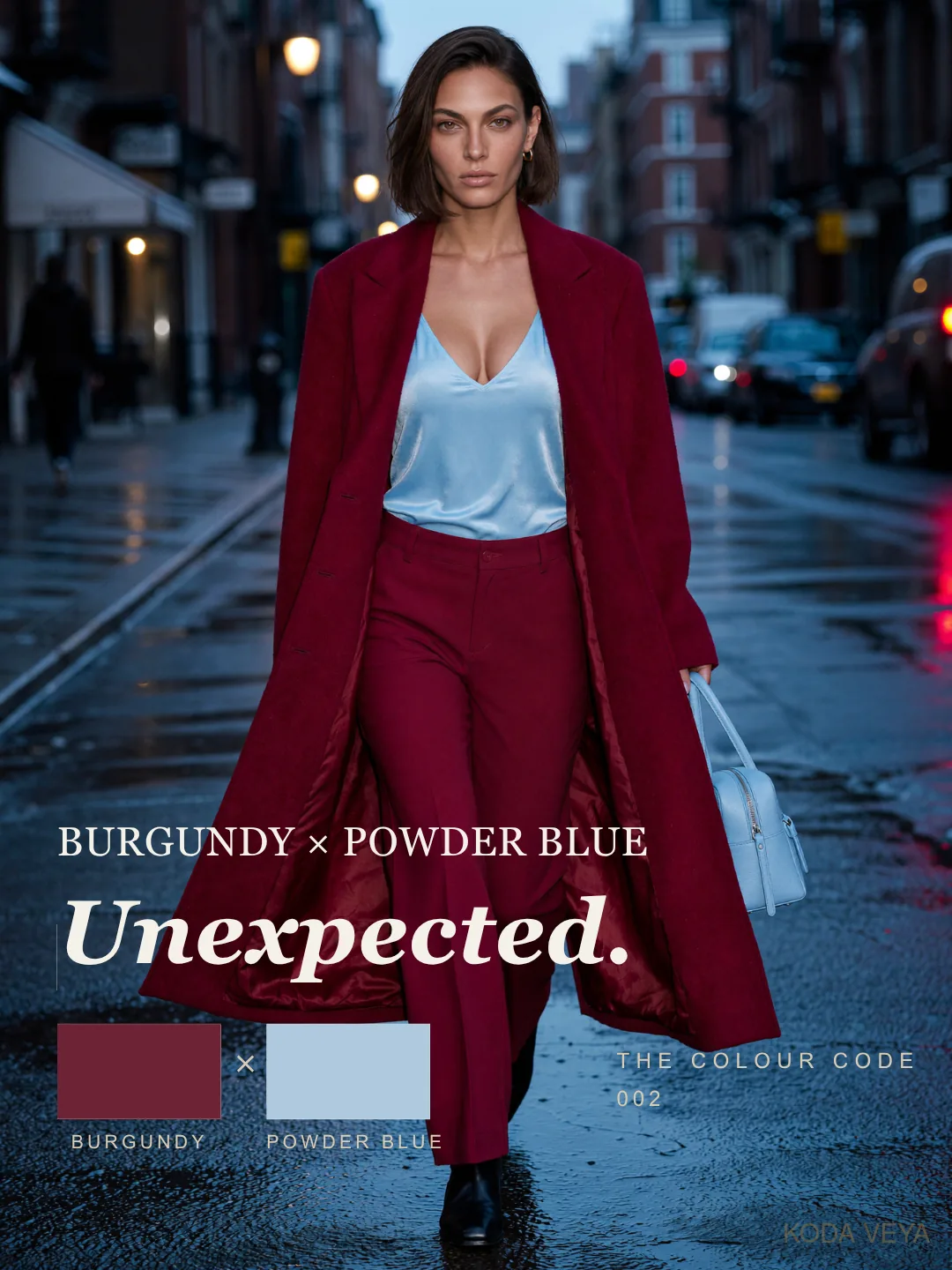
Burgundy gives powder blue weight. Powder blue gives burgundy air.
That is why the combination works. It has contrast without aggression, softness without sentimentality, and just enough tension to stop either colour becoming predictable.
After Camel × Cream — Upscale, which relied on restraint and tonal control, Colour Code / 002 moves somewhere less obvious.
If camel and cream is about precision, burgundy and powder blue is about surprise.
The good kind.
Why Burgundy and Powder Blue Works
Some colour combinations work because they are obviously harmonious.
This isn’t one of them.
Burgundy and powder blue work because they correct each other.
Powder blue can feel too polite on its own. Too clean. Too delicate. Slightly too pleased with its own freshness.
Burgundy fixes that.
It grounds the softness and gives the outfit a centre of gravity.
Burgundy has the opposite problem. Surrounded by other dark colours, it can become dense remarkably quickly. Powder blue opens it up. It brings light without the starkness of white and without reducing the outfit to another neutral formula.
If you want burgundy without the blue, I go through my favourite burgundy outfit ideas, from a sculpted suit to lace and glossy leather.
The result feels considered because the relationship isn’t immediately predictable.
It takes half a second longer to understand.
I like that.
The Temperature Question
This is one of those colour combinations where undertone matters — just not enough to require a spreadsheet.
A heavily purple burgundy beside an icy, almost lilac blue can become theatrical very quickly. At the other extreme, a burgundy that leans too red against a sugary pastel blue can feel strangely sweet.
The strongest versions tend to be slightly muted.
Think wine, oxblood or merlot rather than bright red. For the blue, look for dusty powder, washed cornflower or a soft greyed blue rather than anything too saccharine.
You want contrast.
You don’t want an argument.
And, as ever, fabric changes everything.
Powder-blue wool has depth. Blue poplin is crisp. Burgundy leather feels sharper than burgundy knit. Satin turns both colours into something else entirely once the light changes.
Clothes aren’t paint chips.
Thank God.
Where It Goes Wrong
The first mistake is making the combination too sweet.
Powder blue already carries softness. Add a precious silhouette, dainty shoe and burgundy that leans too pink, and the whole thing can begin to feel decorative.
Pretty isn’t the problem.
Pretty without tension is.
The second mistake is making the outfit too heavy.
A burgundy coat, burgundy boots, burgundy bag and a timid strip of blue somewhere underneath isn’t really a colour combination.
It’s a burgundy outfit with emotional support.
Powder blue needs enough space to matter.
Then there is over-explaining the idea.
You don’t need a burgundy shoe, powder-blue bag, burgundy lipstick and blue earring simply to prove the colours were intentional.
Once the relationship is clear, stop.
The outfit understood you the first time.
01 — Tailored Contrast
This is probably the easiest place to begin.
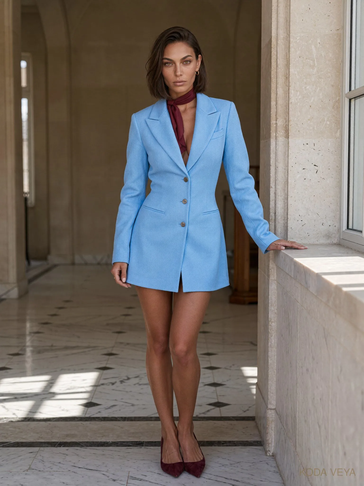
Powder-blue tailoring with burgundy trousers. A pale-blue shirt against an oxblood leather skirt. A clean powder-blue coat over a deeper wine column underneath.
Tailoring gives an unusual colour combination discipline.
One colour brings light. The other brings weight. Clean lines stop the palette drifting into novelty.
I particularly like powder blue near the face here. It brightens the outfit while burgundy lower down gives the silhouette more authority.
The combination starts looking expensive when the fabrics are good and the lines are controlled.
Not because either colour is inherently luxurious.
Because nothing looks accidental.
02 — The Relaxed Version
This is where the pairing becomes more useful.
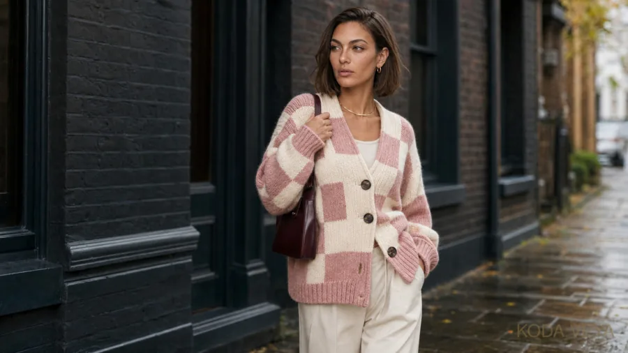
Burgundy and powder blue sound like colours that belong on a runway mood board. They are surprisingly easy off-duty once the silhouettes loosen slightly.
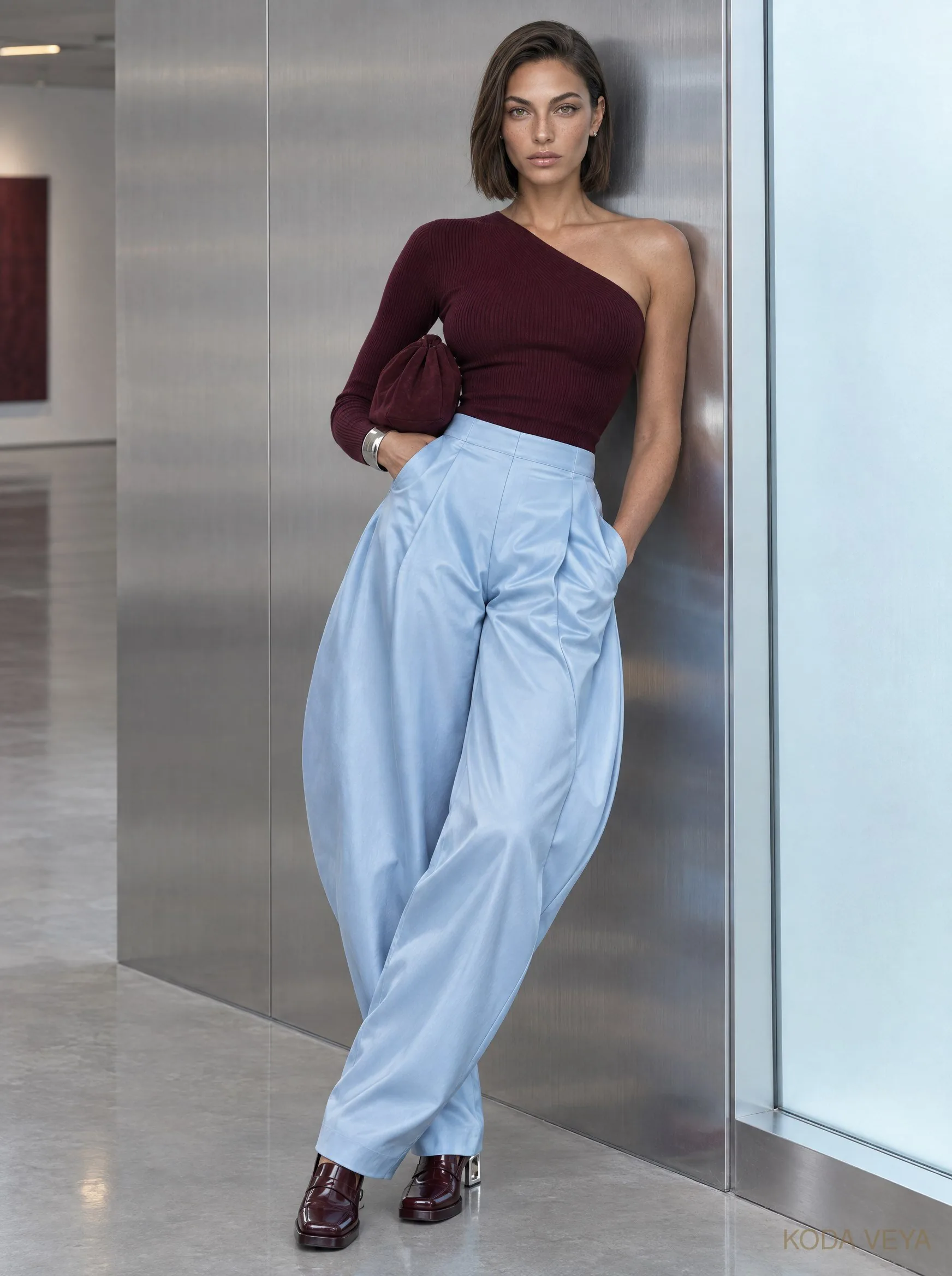
A soft powder-blue knit with burgundy tailored trousers.
A cropped oxblood suede jacket over a pale-blue shirt.
A washed blue oversized knit against a darker burgundy leather skirt.
The important thing is allowing one element to retain some definition.
If every piece is slouchy, the colours can begin to feel random rather than effortless. A sharper shoe, cleaner waistband, structured jacket or more deliberate bag gives the outfit somewhere to land.
Relaxed should still look decided.
03 — After Dark
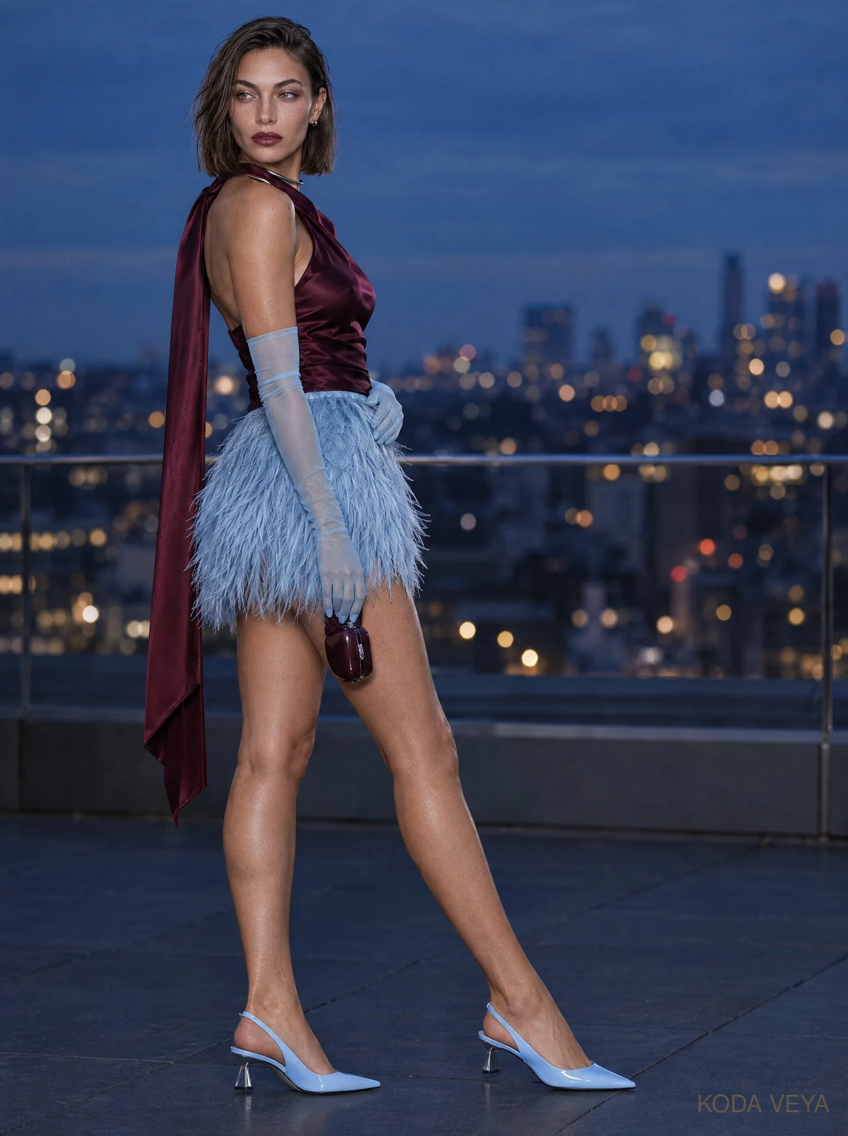
This is where burgundy and powder blue become unexpectedly seductive.
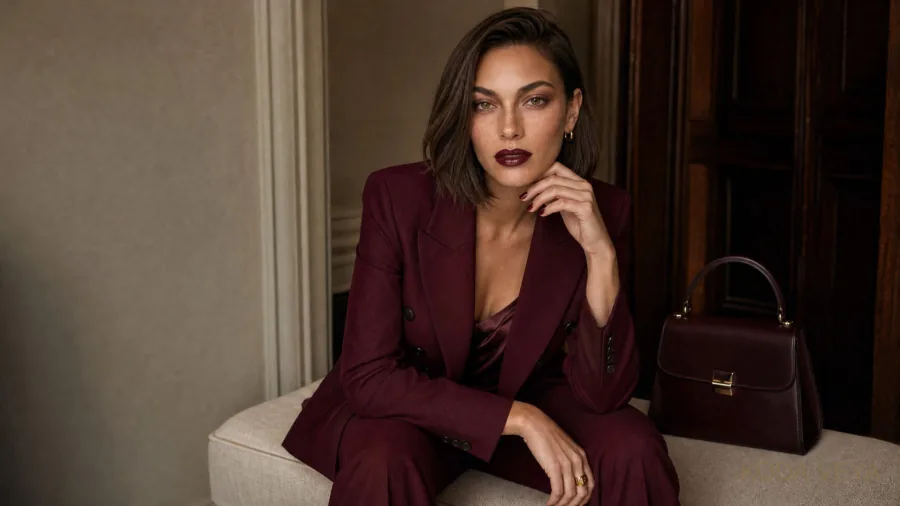
Burgundy silk beneath powder-blue tailoring is excellent. So is a pale-blue satin dress under a long wine-coloured coat. Even a powder-blue evening shoe against a burgundy dress can work beautifully when the rest of the styling knows when to stop.
The appeal is emotional as much as visual.
Powder blue has a certain reserve.
Burgundy doesn’t.
One cools the other down. One pulls the other closer.
The pairing doesn’t become louder after dark.
It becomes more magnetic.
That’s considerably more useful.
Texture Changes the Conversation
Colour gets the attention, but texture often decides whether the outfit works.
Powder-blue brushed wool feels soft and expensive. The same colour in crisp cotton is fresher and more graphic.
Burgundy satin has depth and movement. Burgundy leather becomes harder, cleaner and slightly more dangerous. Suede softens it again.
That is why the same two colours can move from tailoring to off-duty dressing to evening without feeling repetitive.
The mood isn’t only changing because of the silhouette.
The surfaces are doing some of the talking.
If an outfit feels almost right, I’d look at the fabric before abandoning the colour combination.
Sometimes everything is simply speaking in the same voice.
Shoes, Bags and the Third Colour
Burgundy and powder blue don’t need much help.
They need the right interruption.
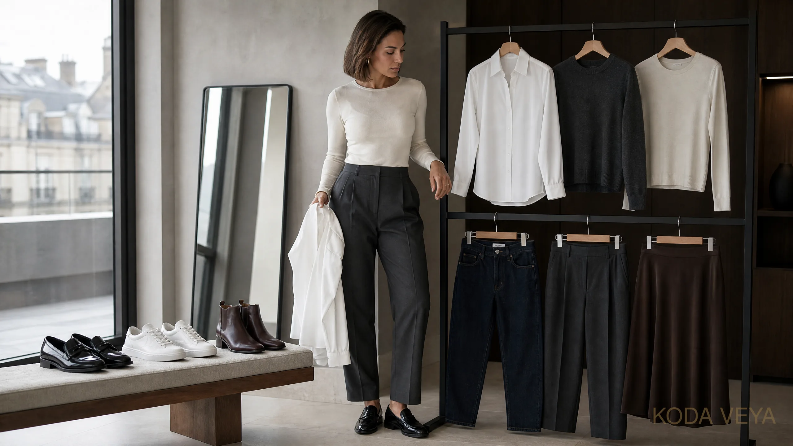
Chocolate and espresso leather are excellent because they deepen the palette without introducing another obvious colour story.
Black works too, particularly if you want the outfit to feel sharper.
Cream is useful when you need a quieter third note. A small amount can give the colours breathing space without dragging the whole look back into neutral territory.
Grey can work beautifully, but it needs conviction. A very vague soft-grey accessory can make the palette feel as though somebody lost their nerve halfway through.
For jewellery, silver pushes the blue cooler and makes the combination feel more modern. Gold warms the burgundy and introduces a little richness.
Neither is correct.
That’s the advantage of dressing rather than solving an equation.
Why It Feels New
Part of the appeal is that burgundy and powder blue don’t belong to the same familiar visual uniform.
They don’t immediately say quiet luxury.
They don’t rely on beige.
And they aren’t trying desperately to prove that colour is back by shouting across the room.
They simply make a more interesting proposition.
That matters because sophistication and personality were never opposites.
Somewhere along the way, fashion occasionally behaved as though looking polished required removing every surprising decision from an outfit.
It doesn’t.
Sometimes looking more considered simply means resisting the colour you would normally choose automatically.
The Koda View
Burgundy and powder blue work because neither colour gets to behave as expected.
Powder blue stops being precious.
Burgundy stops being heavy.
Keep the silhouette relatively clean, let one colour lead and use texture for depth. Once the pairing is established, resist the urge to decorate the idea until nobody can see it anymore.