How to Wear Chocolate Brown and Cobalt Blue: Bold Outfit Ideas
Chocolate brown and cobalt blue outfit ideas, styling rules and elegant ways to wear this bold colour combination without making it feel loud or overworked.
Chocolate brown spent a long time being treated as black’s quieter, slightly more sensible relative.
Cobalt has never had that problem.
One absorbs attention. The other demands it.
Put them together and something useful happens: chocolate gives cobalt enough weight to stop it feeling obvious, while cobalt stops brown disappearing into the tasteful-neutral background.
Chocolate × Cobalt is electric because neither colour gets diluted.
Why Chocolate and Cobalt Works
Brown and blue are hardly strangers.
Denim has been doing this for decades.
But cobalt changes the relationship.
This isn’t indigo with tan leather. Cobalt is cleaner, colder and considerably less interested in blending in. Against chocolate brown, that intensity becomes more sophisticated rather than less.
Chocolate provides depth.
Cobalt provides interruption.
The warm brown makes the blue look brighter. The blue makes the brown look richer.
Chocolate takes some of cobalt’s obviousness away without taking away its energy.
The blue still has impact.
It just feels richer beside brown.
The Brown Matters
Not every brown is going to do the job equally well.
Chocolate should actually look like chocolate.
Deep, rich, slightly warm, with enough saturation to stand beside the blue. Pale tan will make cobalt feel louder. Grey-brown can make it colder. Orangey brown can send the whole thing somewhere worryingly close to retro sportswear.
A proper dark chocolate gives cobalt something substantial to push against.
Cobalt needs similar discipline.
Too pale and you’ve wandered into powder blue.
Too navy and you’ve lost the point.
The blue should be unmistakable from across the room.
If you’re wondering whether it’s cobalt, it probably isn’t.
Where It Goes Wrong
The first mistake is letting cobalt become the entire event.
Cobalt coat. Cobalt shoe. Cobalt bag. Blue eye makeup.
We understand.
One strong cobalt area usually does more than four small declarations of enthusiasm.
The second problem is muddy brown.
Chocolate works because it is rich enough to feel deliberate. A vague mid-brown beside vivid blue can look as though one half of the outfit was chosen under completely different lighting.
Then there is the temptation to make the styling too sporty.
Cobalt already carries energy. Add glossy nylon, bright trainers and too much technical fabric and chocolate starts looking less luxurious and more accidental.
That might be exactly what you want.
It isn’t what I’m doing here.
And finally: don’t neutralise it to death.
If you add a cream coat, beige bag, white shoe and delicate gold jewellery simply to make the pairing feel safer, you’ve rather missed the point.
This one is allowed to have a pulse.
01 — The Strong Line
The cleanest version is also the most powerful.
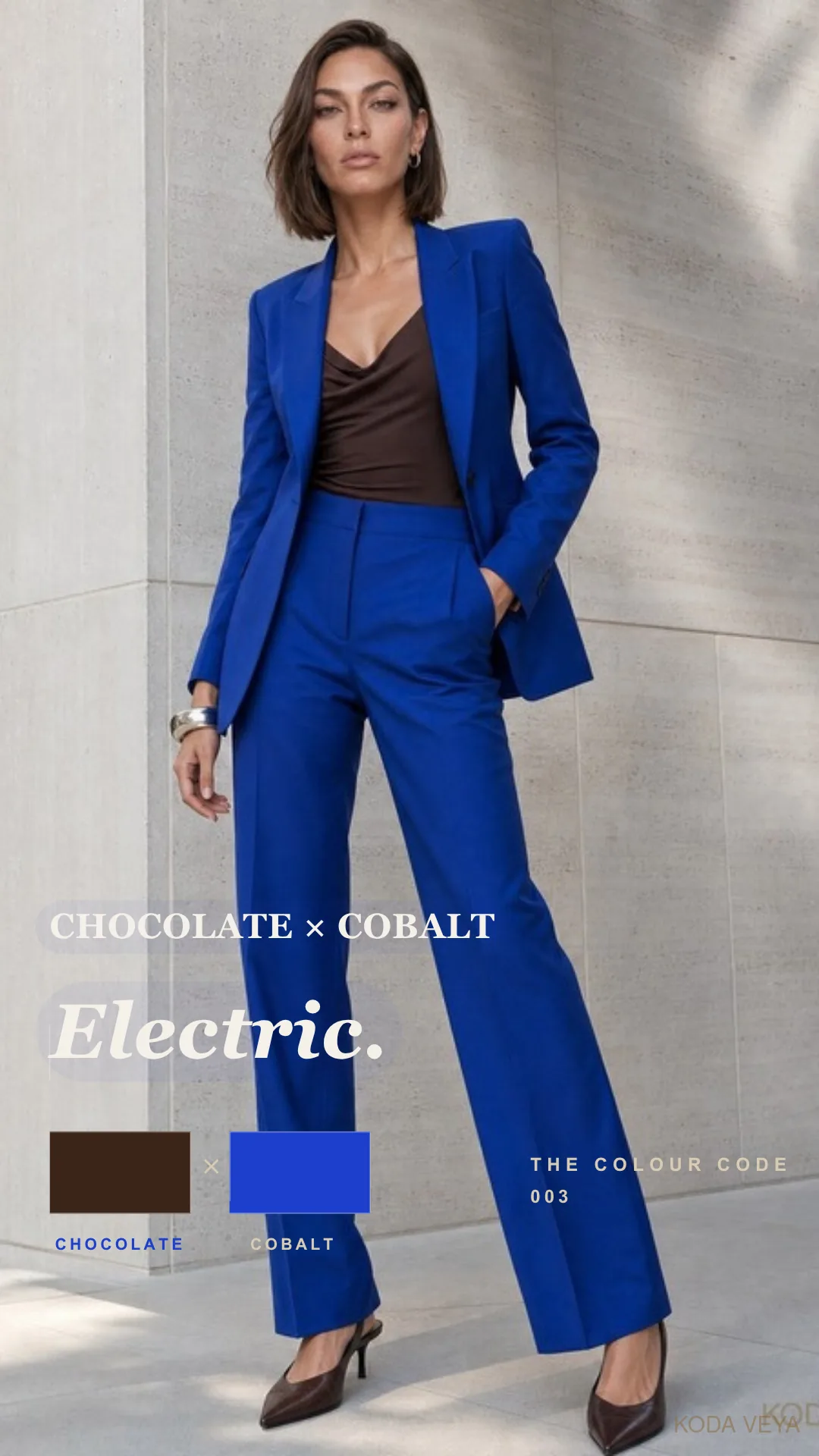
A sculptural cobalt coat over a dark chocolate column.
Chocolate trousers with a sharply cut cobalt jacket.
A saturated blue knit against deep brown leather.
The silhouette should stay relatively uncomplicated because the colours have already done the interesting part.
Cobalt works particularly well on the upper half. Near the face, it brings light and intensity; chocolate underneath steadies everything.
Reverse it and the mood changes.
A chocolate jacket over cobalt silk feels warmer, less graphic and slightly more unexpected.
Neither is better.
They simply say different things.
02 — Off-Duty, Without Going Quiet
This combination doesn’t need tailoring to work.
A cobalt knit with deep chocolate denim.
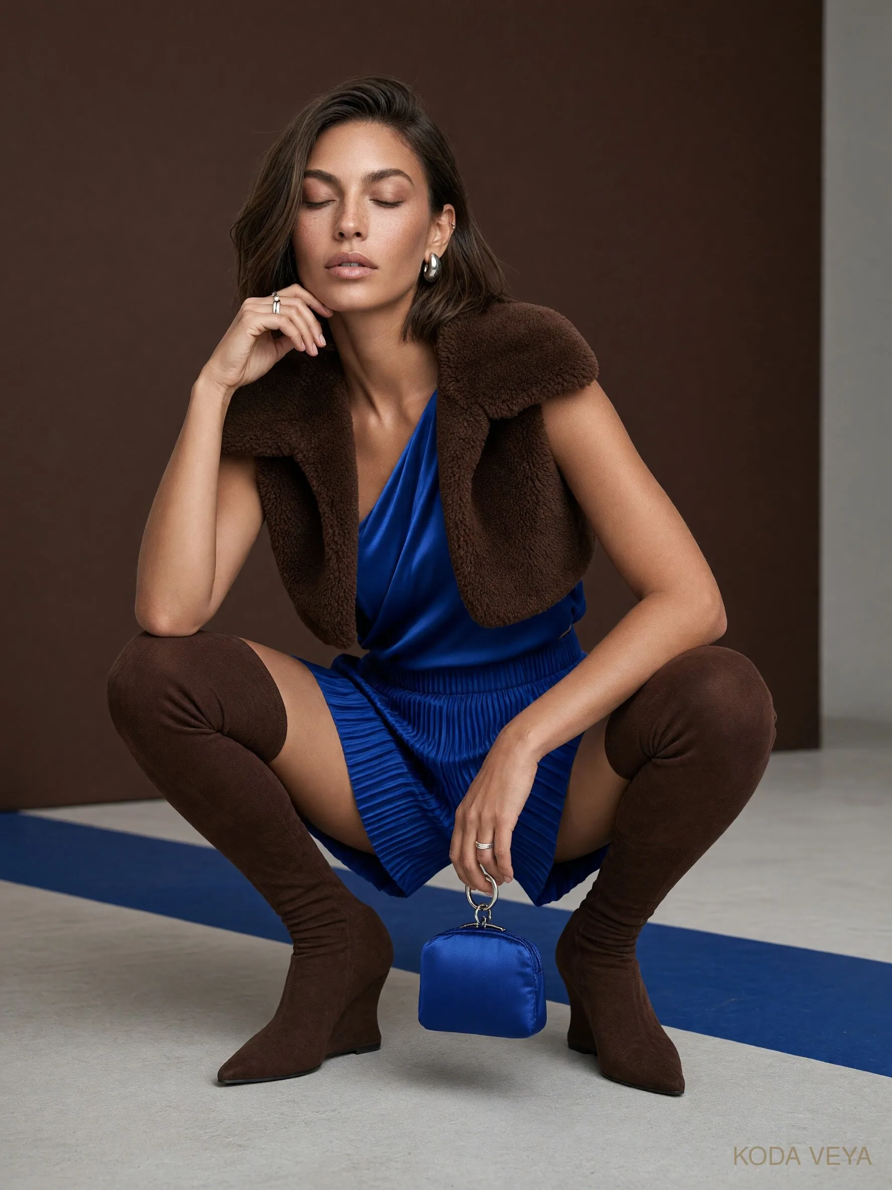
A brown suede jacket over a cobalt jersey dress.
A saturated blue shirt with chocolate leather trousers and a shoe that knows when to leave well enough alone.
The casual version is where texture becomes especially important.
Brown suede absorbs light while cobalt tends to throw it straight back at you. Denim can work too, though I’d avoid adding blue denim unless you deliberately want the outfit to become a three-blue conversation.
There is such a thing as enthusiasm becoming administrative.
Keep the colours clear.
Let the materials create the variation.
03 — After Dark
Chocolate becomes considerably more interesting at night.
Under lower light, satin and leather reveal depth that can disappear during the day. Put cobalt beside them and the blue almost glows.
A chocolate silk dress with a cobalt evening coat.
Cobalt satin against a sharply cut brown jacket.
A deep chocolate column with one extraordinary blue shoe.
This is the version where I’d be most restrained with jewellery.
The colour relationship already feels dramatic. It doesn’t need to be surrounded by evidence.
One cuff.
One earring.
Perhaps nothing at all.
There are worse things than letting the clothes finish the sentence.
Texture Is the Amplifier
Chocolate and cobalt already have contrast in colour.
Texture decides whether that contrast feels sophisticated or simply loud.
Chocolate suede beside cobalt silk is entirely different from brown satin with blue wool.
Leather gives chocolate authority. Velvet makes it more decadent. Fine wool keeps it modern. Silk introduces light and movement.
Cobalt changes too.
In cashmere, it softens.
In satin, it becomes almost liquid.
In structured wool, it turns architectural.
This is why the pairing can feel strong without relying on pattern.
There is already enough happening.
Let the surfaces change the volume.
Shoes, Bags and the Third Colour
This is one of the few Colour Code pairings where I’d pause before adding a third colour.
Chocolate and cobalt are already complete.
Black can sharpen the outfit.
Cream can introduce a little breathing space.
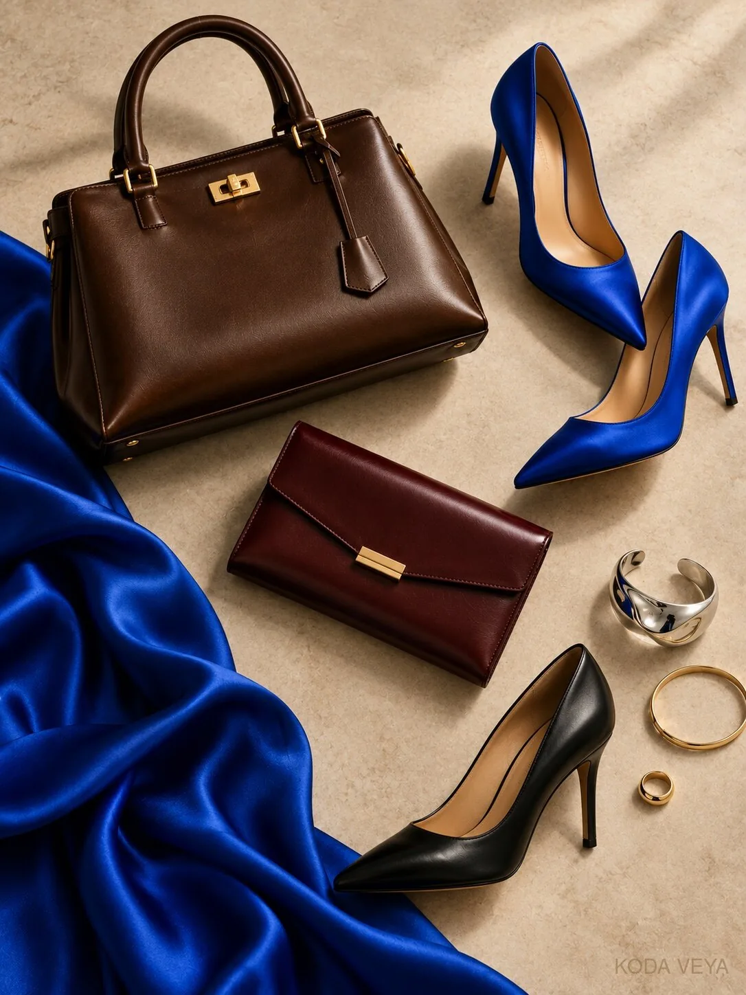
Oxblood is interesting because a very dark burgundy accessory can sit almost like a neutral beside chocolate while adding richness.
But none of them are necessary.
That is the important bit.
For metals, silver pushes cobalt cooler and more contemporary.
Gold warms the brown.
Both work.
What doesn’t work is piling on jewellery simply because the outfit is colourful and apparently needs “balance.”
It doesn’t.
Balance isn’t the same as adding things.
Why Chocolate Brown Is More Useful Than Black
Black would be easier.
That’s precisely why chocolate is better here.
Cobalt with black is sharp, graphic and immediate.
Chocolate complicates it.
The warmth changes the blue. It makes the pairing feel less obvious and gives you more room to play with suede, leather, silk and wool without the outfit becoming severe.
Brown also has a softness that black doesn’t.
Not weakness.
Depth.
And that distinction matters, particularly with a colour as assertive as cobalt.
Sometimes the strongest colour combination isn’t the one with the highest contrast.
It’s the one where each colour makes the other look better.
Why It Feels Different
Part of the appeal of chocolate and cobalt is that it sits between two familiar fashion instincts.
Chocolate still has all the sophistication of a neutral.
Cobalt refuses to behave like one.
That tension is what makes the pairing feel current without making it dependent on a trend.
You can wear the same chocolate coat next year.
The same cobalt knit too.
What makes the outfit interesting is the decision to put them together.
And that is increasingly what I want from colour.
Not novelty.
Point of view.
The Koda View
Chocolate and cobalt don’t need persuading to be interesting.
The danger is helping too much.
Choose a proper chocolate brown. Let cobalt actually be cobalt. Keep the silhouette cleaner than your instinct might suggest, and use fabric rather than extra colour to create complexity.