How to Wear Camel and Cream: 3 Outfit Ideas That Look Expensive
Camel and cream outfit ideas, styling rules and three ways to wear the pairing without looking flat, predictable or overly tonal.
Camel and cream have acquired an unfortunate reputation for being safe.
They aren’t.
Bad camel and cream is safe. Good camel and cream is precise.
The difference is rarely the colour itself. It is proportion, texture and knowing when two neutrals are close enough to look intentional — but not so close that the entire outfit disappears into beige.
Camel gives an outfit weight. Cream gives it light.
That is why the pairing feels softer than camel with stark white, but more defined than dressing entirely in beige. One colour gives the silhouette structure; the other stops it becoming heavy.
The relationship matters more than the individual shades.
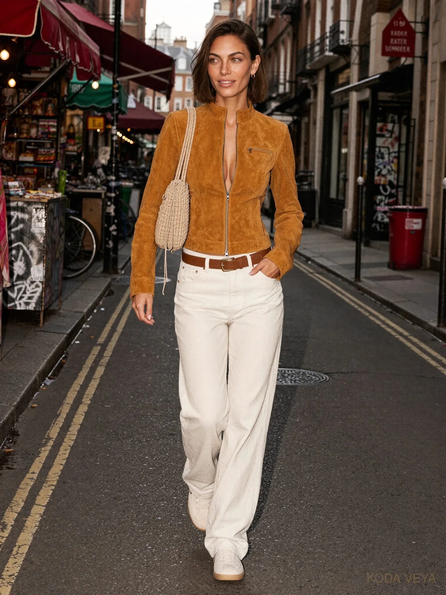
A rich caramel wool coat against soft cream cashmere has depth. A camel leather jacket against ivory silk has tension. Even two very simple pieces can look considered when their surfaces behave differently.
The best camel-and-cream outfits don’t really look monochromatic.
They look layered.
And that is an important distinction.
Warmth Matters — But Not as Much as You Think
There is a temptation to turn colour matching into mathematics.
Warm camel must apparently meet warm cream. Cooler camel requires ecru. Honey belongs with vanilla. Oatmeal must consult a chart before leaving the house.
Useful, up to a point.
If a very orange camel is sitting directly beside a cold blue-white, the difference can look accidental. A softer cream usually gives warm camel somewhere more natural to land.
But clothes aren’t paint samples.
Fabric, distance and proportion all change how we read colour. A cool cream blouse under a warm camel coat can work beautifully if there is enough contrast in texture and the rest of the outfit feels deliberate.
The rule isn’t that every undertone must match.
The rule is that nothing should look as though you noticed the mismatch after you left the house.
Where It Goes Wrong
Camel and cream are easy colours to wear badly precisely because they are easy colours to buy.
The first problem is too much sameness.
Camel wool coat. Beige knit. Tan trousers. Beige shoes. Tan bag.
Technically coordinated.
Visually asleep.
A restricted palette needs contrast somewhere else. That can come from silhouette, weight, shine, skin, hardware or proportion. If every garment is soft, matte, mid-weight and approximately the same shade, no amount of expensive fabric is going to make the outfit interesting.
The second problem is everything being soft.
A brushed coat, fluffy knit and fluid trouser can look luxurious individually and strangely shapeless together. Something needs to hold the outfit still.
A sharp shoulder. A leather shoe. A clean waistband. A structured bag.
Not everything needs to move.
And then there is trying too hard to match.
Your shoes don’t need to be exactly the same camel as your coat.
In fact, they are usually better when they aren’t.
01 — The Long Line
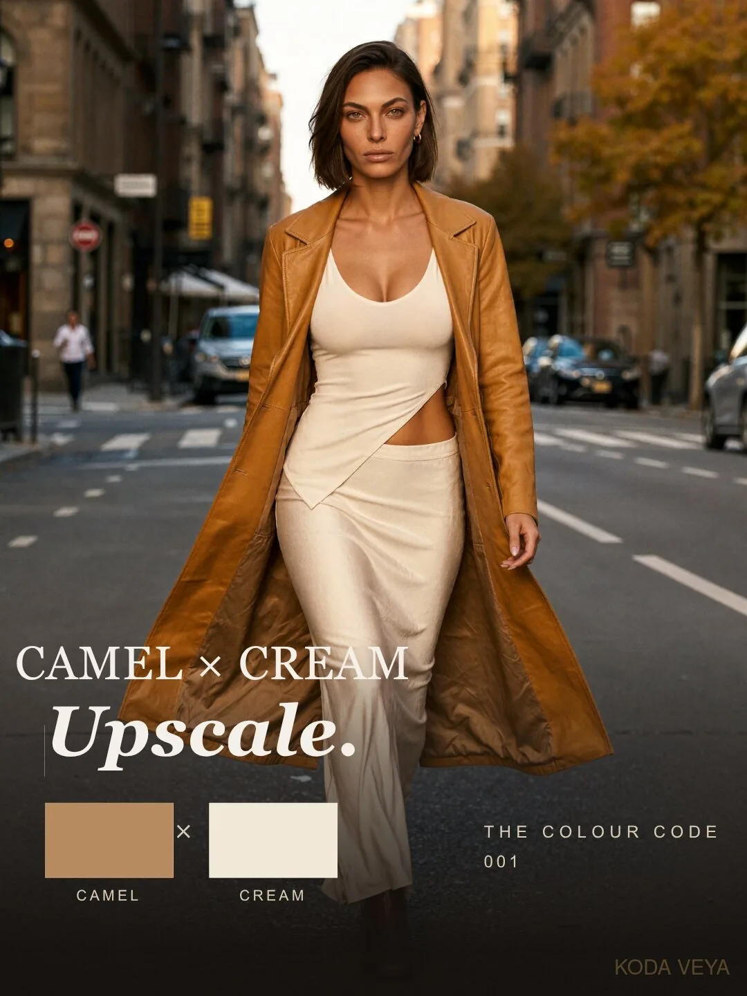
This is the version people tend to picture first: cream underneath, camel outside.
And for good reason.
A cream knit with cream tailored trousers creates a clean vertical column through the body. The camel coat then becomes a frame around it rather than another colour competing for attention.
The trick is proportion.
If the coat is generous, keep the layer underneath cleaner. If the trousers are wide, the knit should still give the waist some definition. An outfit can be relaxed without surrendering its shape.
This is also where texture becomes useful. Cashmere against wool. Ribbing against smooth tailoring. Matte cream against a slightly richer camel surface.
The colours are quiet.
The clothes shouldn’t be.
02 — The Reverse
Cream on top, camel underneath feels completely different.
Less formal. Less obviously polished. More interesting, actually.
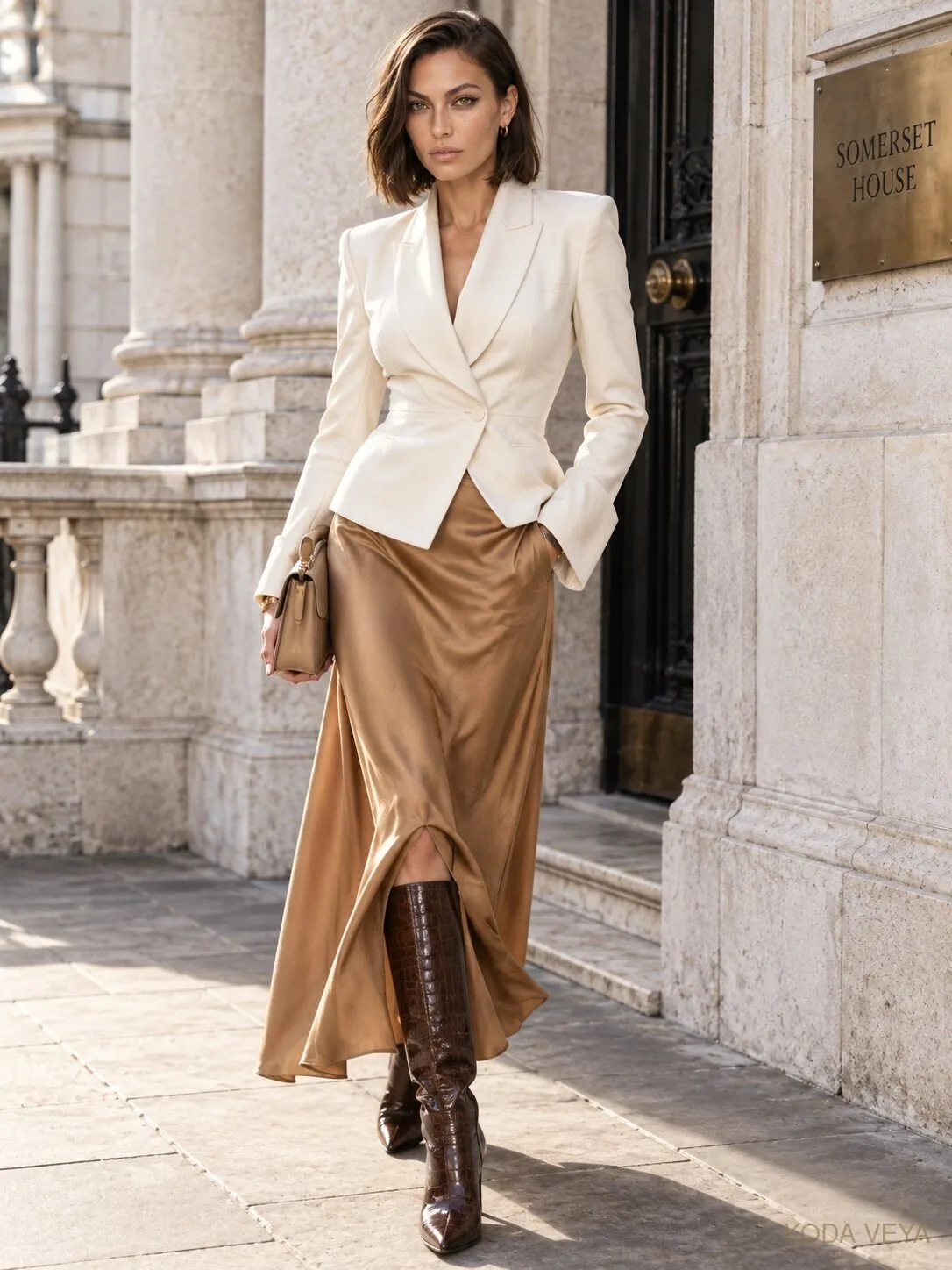
A cream knit over camel trousers or a camel leather skirt pulls light toward the face while allowing the lower half of the outfit to feel more grounded.
It is especially good when the cream piece has volume — an oversized crew neck, perhaps — and the camel underneath is cleaner and more controlled.
What I wouldn’t do is add another tan bag, camel shoe and beige coat simply because everything technically belongs to the same family.
At some point the family needs to invite somebody else to dinner.
Espresso leather is usually an excellent guest.
03 — After Dark
This is where camel and cream stop being polite.
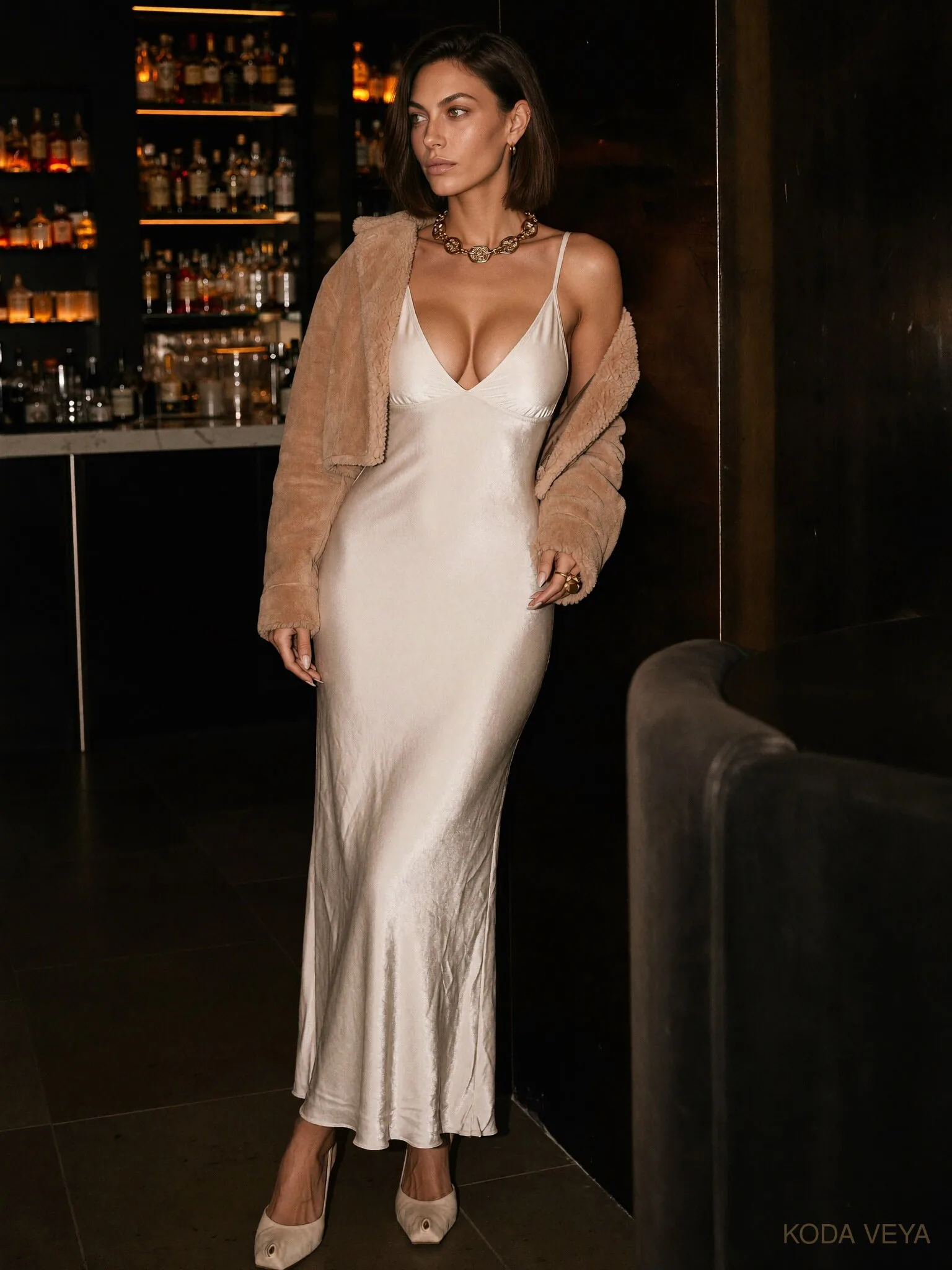
Cream silk changes the entire conversation.
A slip dress, fluid blouse or satin skirt introduces shine and movement into what can otherwise become a very matte palette. Put sharp camel tailoring over it and suddenly the pairing has tension.
Soft against structured.
Light against weight.
Fluid against severe.
That contrast is far more useful than adding another colour simply because the outfit feels too neutral.
For evening, I prefer camel slightly deeper and richer rather than pale tan. It holds its own against silk and looks better under lower light.
Warm gold jewellery makes sense here, but restraint still matters.
One strong cuff or substantial earring is more interesting than turning yourself into the accessories department.
Texture Does More Than Pattern
Pattern isn’t forbidden.
It just isn’t usually necessary.
When you’re working with two colours this close together, texture can create the separation that print normally provides.
Brushed wool absorbs light. Silk throws it back. Leather gives you a clean surface. Ribbed knit creates shadow. Suede softens everything around it.
That is why a simple camel coat over a cream silk blouse can feel richer than an outfit with twice as many elements.
There is more happening than you first notice.
Which is generally preferable to the opposite.
Shoes, Bags and the Third Colour
Camel and cream don’t need much accessorising.
They need the right interruption.
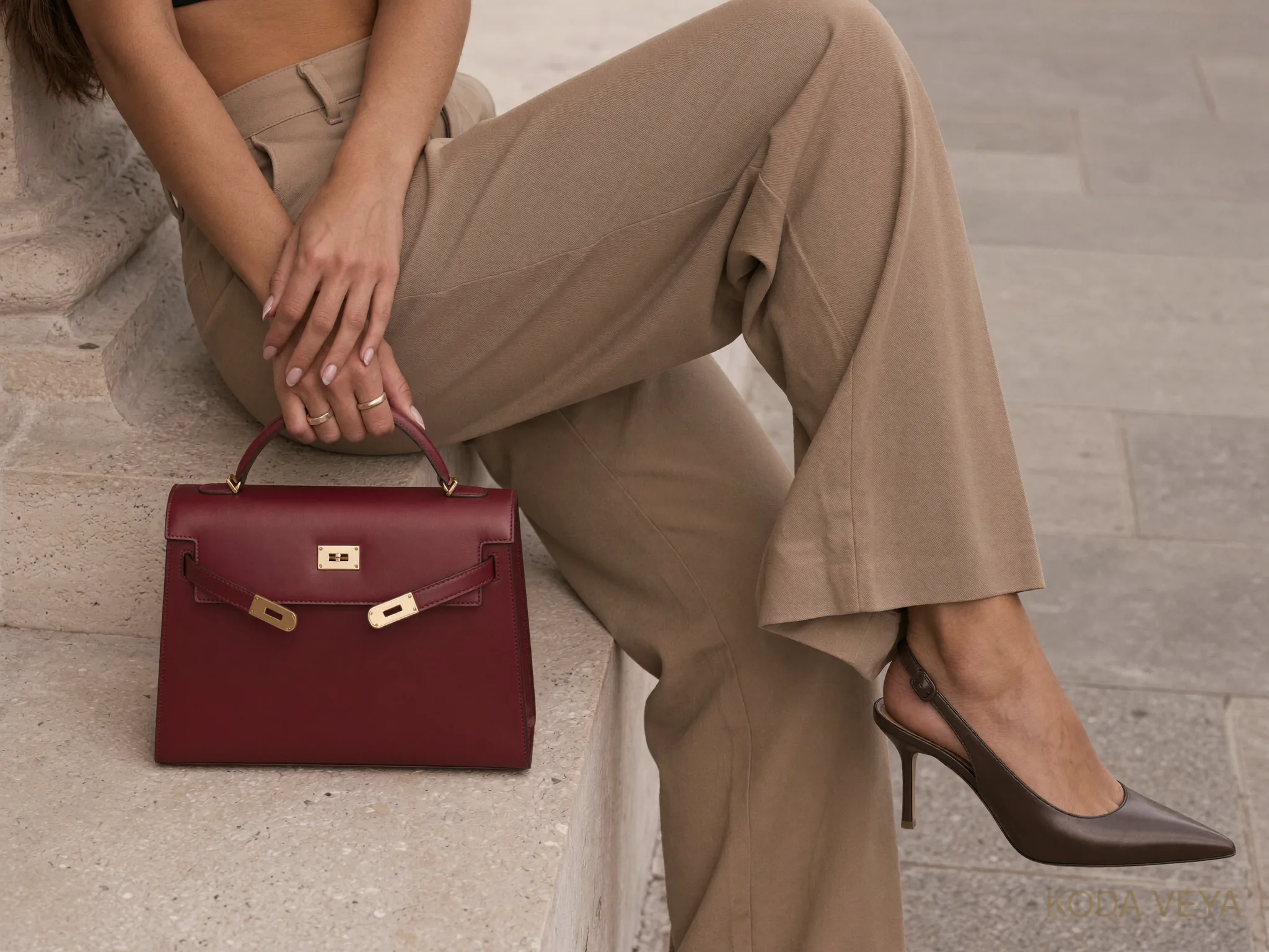
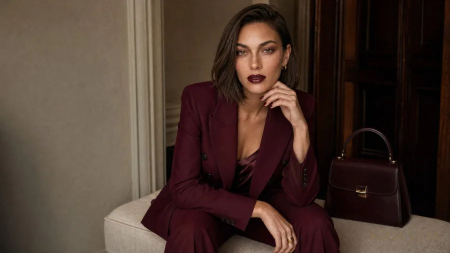
Deep chocolate or espresso leather usually gives the palette more depth than another perfectly matching tan accessory. Oxblood can work beautifully too, particularly in autumn, because it adds richness without suddenly making the outfit about colour.
Black is possible, but it changes the mood completely.
A black shoe beneath camel and cream gives the look a harder edge. Sometimes that is exactly what is needed.
Other times it looks like the shoes arrived from another outfit.
Context matters.
For jewellery, gold is the obvious choice because it sits naturally beside the warmth of camel. That doesn’t make silver illegal. A sculptural silver piece can actually make the combination feel less predictable.
The important thing isn’t to accessorise a camel-and-cream outfit according to a checklist.
It was doing perfectly well before we started helping.
The Expensive-Looking Problem
Camel and cream are constantly described as colours that make an outfit “look expensive.”
Sometimes they do.
Sometimes they simply make an inexpensive outfit beige.
There is a difference.
What reads as elevated is usually not the colour combination itself. It is the absence of unnecessary information.
A clean hem. Proper length. Good proportion. Fabric that behaves as expected. A shoe that finishes the silhouette rather than interrupting it.
You can’t colour-coordinate your way around poor fit.
And you certainly don’t need a luxury label to get this right.
Upscale doesn’t mean expensive. It means considered.
That is why camel and cream continue to work long after whichever trend originally made us notice them has moved on.
Keep the palette tight, but vary the surfaces. Let one piece provide structure. Let the other bring light. Resist the urge to match everything within an inch of its life.
And if the outfit begins to feel a little too tasteful?
Change one thing.
The shoe. The jewellery. The fabric. The proportion.
Not because camel and cream are boring.
Because good neutrals deserve better than being used as camouflage.