On paper, they don’t have much in common. Olive belongs to utility jackets, old military references and colours that know how to survive a British winter. Lilac has spent years being treated as something softer — spring dresses, delicate knits, the pastel end of the wardrobe.
Put them together and something useful happens.
The olive takes the sweetness out of the lilac. The lilac takes the seriousness out of the olive. Neither colour has to become something else. They just stop behaving exactly as expected.
That is usually where the interesting combinations begin.
If Chocolate × Cobalt — Electric was about contrast you could see from across the room, Olive × Lilac works differently. The surprise arrives a little later. It is quieter. Slightly strange. And much better for it.
01 — City
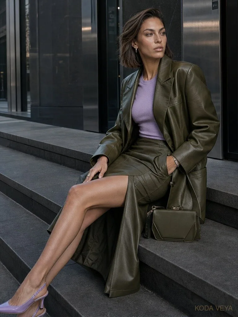
70% Olive / 30% Lilac
Start with olive. A lot of it.
The easiest way into this pairing is to let the more familiar colour do most of the work, then use lilac exactly where you would normally reach for cream, black or grey.
An olive leather coat already has weight. Add an olive skirt and the look becomes almost monochromatic — strong, urban, slightly severe.
Then put lilac underneath it.
Suddenly the whole thing shifts.
The fitted lilac knit in this look isn’t really acting as a “pop of colour.” I’m increasingly suspicious of that phrase anyway. Good colour should do more than pop.
Here, it changes the temperature of everything around it. The olive leather feels less utilitarian. The lilac feels less delicate. Even the lilac slingback works because it repeats the idea without trying to match the entire outfit.
That is the first rule of this pairing: don’t make the colours take equal turns. Let one lead. Let the other interfere.
The reason this look works isn’t because olive and lilac have been distributed evenly. It works because the olive builds the sentence and the lilac changes its meaning. That slight imbalance is what keeps it modern.
02 — Tailoring
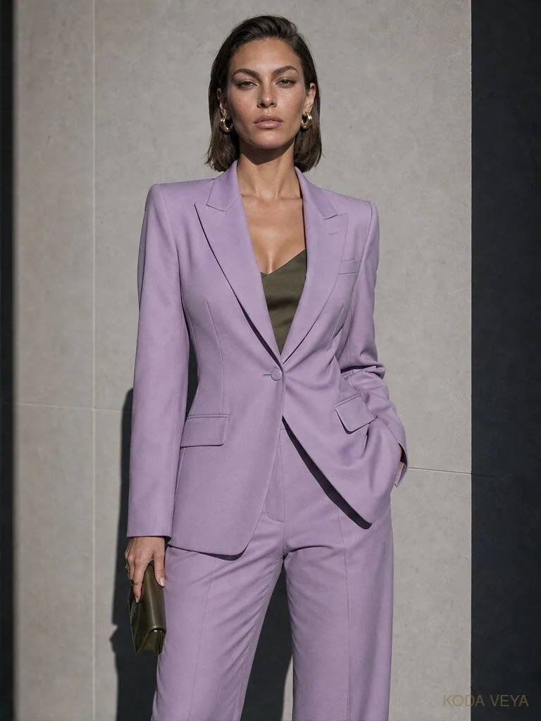
20% Olive / 80% Lilac
Then reverse it.
A lilac suit could go wrong in several predictable ways. Too pale and it starts looking bridal. Too soft and it becomes corporate pastel. Add a silky blouse, delicate shoe and matching bag and you are suddenly dressed for an event you may not actually be attending.
So instead of making lilac prettier, make it stricter.
Strong shoulder. Defined waist. Straight trouser. Very little decoration.
The olive underneath barely needs to announce itself. A dark olive camisole appearing at the neckline is enough to stop the suit becoming too polished. Then repeat the olive once, somewhere lower down — a shoe, a small clutch, a piece of leather. Not everywhere.
This is the opposite ratio to the first look, but the principle is the same. One colour owns the outfit. The other makes it more intelligent.
I particularly like olive with tailoring because it introduces something slightly earthy into a silhouette that can otherwise feel very controlled. Lilac brings the impact. Olive keeps it from becoming precious. That is a useful relationship.
03 — Daylight
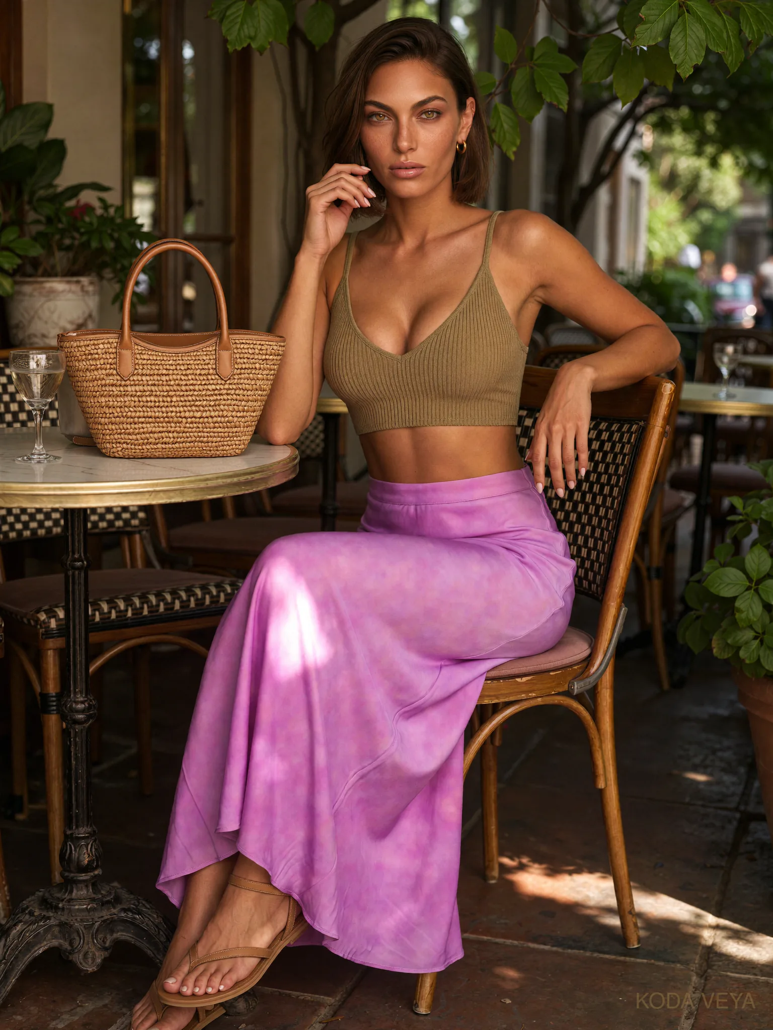
35% Olive / 65% Lilac
This is probably the version I’d actually wear most often. Not because it is the safest. Because it is the least aware of itself.
An olive ribbed top with a fluid lilac skirt doesn’t immediately read as a colour experiment. There is no dramatic coat, no statement tailoring, no obvious evening proposition.
It just looks good. And that matters. Colour combinations become much more useful once they can survive outside the photograph designed to explain them.
The texture does a lot of the work here. The olive knit is matte, close to the body and slightly utilitarian. The lilac skirt is fluid, luminous and moves when you do. If both pieces were silky, the outfit would become too romantic. If both were heavy and matte, the colours would lose some of their tension. One grounded. One fluid. That is enough.
The warm leather and woven bag also stop the pairing from feeling over-styled. They aren’t part of the olive-lilac equation at all, really. Which is exactly why they belong. A colour combination doesn’t have to consume the whole outfit. Sometimes the best thing you can add is something that refuses to participate.
That is what makes this image important to the series. The first two looks show how to style olive and lilac. This one shows how to live in it.
04 — Evening
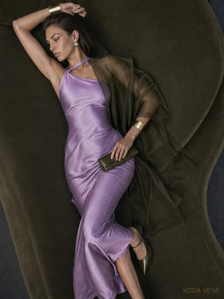
40% Olive / 60% Lilac
Then let it become stranger.
Evening is where I’d stop trying to make olive and lilac behave like two blocks of colour and start treating one of them almost like light and the other like shadow.
A lilac satin dress already shifts as it moves. Under direct light it can look bright and almost metallic; in shadow it becomes smokier and more complicated. Put sheer olive over it and the colours begin to overlap.
That is far more interesting than a lilac dress with an olive handbag. The olive doesn’t sit beside the lilac here. It changes it. That is the difference.
A translucent olive layer over lilac creates areas where neither colour is completely itself. The green deepens. The lilac becomes murkier. Parts of the dress disappear into shadow and then return as the light moves. It feels less like colour blocking and more like colour mixing.
And because the clothes are already doing that work, the jewellery can become stronger. A wide gold cuff. Larger earrings. A couple of rings. This is one of those moments where restraint doesn’t necessarily mean less. It means knowing where the excess belongs. The dress can move. The jewellery can catch the light. Everything else can stop talking.
Why Olive × Lilac Works
There is a reason this pairing feels slightly odd without feeling wrong.
Olive is muted. Lilac is lifted. One absorbs light; the other tends to reflect it. One carries associations with utility and earth; the other with softness and decoration. Put them together and each colour corrects the most predictable version of the other.
That doesn’t mean any olive works with any lilac. The olive I like here is deep, slightly greyed and complicated — closer to moss, military or dark khaki than bright green.
The lilac needs some substance too. Too sugary and the combination starts looking childish. Too icy and it can become disconnected from the warmth of the olive. A lilac with a little smoke in it is better. Something that has grown up.
Where It Goes Wrong
The first mistake is making the whole thing too soft. Lilac blouse. Flowing olive trouser. Delicate shoe. Pretty jewellery. Nothing is technically wrong, but there is no friction left.
Give one of the colours a harder material. Leather. Sharp wool. Patent. A compact knit. Something with an edge.
The second mistake is forcing symmetry. An olive top with a lilac bottom doesn’t require an olive bag and lilac shoes so that everybody gets two turns. Once you start balancing colours like an equation, the outfit begins to look assembled. Use the ratio. Then stop.
And the third mistake is turning olive into camouflage. It doesn’t need tan boots, safari references, utility pockets and three different shades of khaki surrounding it. Olive is already olive. It knows what it is. Let lilac take it somewhere else.
The Colour Ratio
This is one of those pairings where changing the proportion genuinely changes the personality.
At 70 olive / 30 lilac, it feels urban and grounded. Reverse it to 20 olive / 80 lilac and it becomes fashion-first, sharper and considerably more noticeable. Around 35 olive / 65 lilac, it relaxes — the pairing starts to feel natural enough for daytime rather than something you deliberately constructed.
And by evening, I care less about mathematical purity. Let the colours overlap. Let transparency, shadow and reflected light complicate the ratio. The point of understanding the rule is knowing when you no longer need to obey it literally.
The Koda View
Olive and lilac shouldn’t work because they match. They should work because they correct each other.
Olive makes lilac less sweet. Lilac makes olive less sensible. And somewhere between the two is an outfit that feels considerably more individual than either colour usually does on its own.
That is the part worth keeping. Because the best colour combinations are rarely the ones everybody agrees with immediately. Sometimes they need half a second.
Offbeat doesn’t mean difficult. It means the obvious answer wasn’t interesting enough.